Copilot AI Navigation Redesign — ZoomInfo
The navigation nobody planned for — and why that was the real problem
Director of Product Design · 3 months · 100+ people across 3 product orgs
ZoomInfo's first generative AI initiative was Copilot — an intelligent account analysis tool built to help sales reps find and close the right prospects faster. The mandate was clear: use AI to increase sales for our customers. The path to getting there was not.
As Director of Product Design, I led UX strategy and design execution across a team spanning SalesOS, MarketingOS, and Admin Portal. With 100+ people across three product orgs, coordination alone was a full-time job. But the harder problem wasn't coordination. It was something nobody had put on the roadmap.
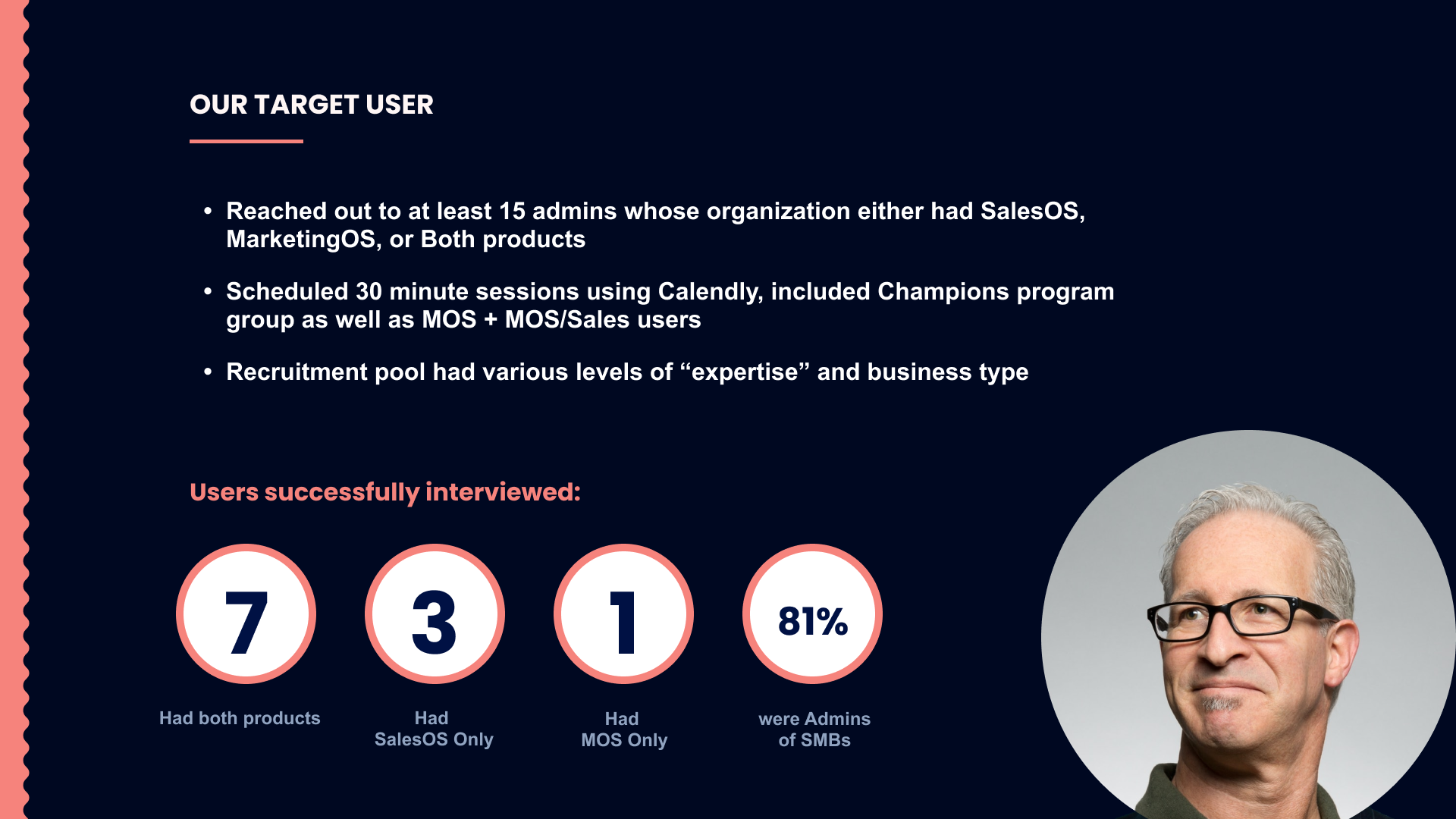
While mapping the Copilot setup experience, I kept running into the same friction: features existed across the product suite, but users couldn't find them. Navigation was inconsistent. Naming was inconsistent. Where things lived made sense to the team that built them, and to no one else.
The new AI features were being added on top of an architecture that was already broken. Leadership's assumption was that onboarding would solve discoverability. I didn't believe that, and I had to find a way to prove it.
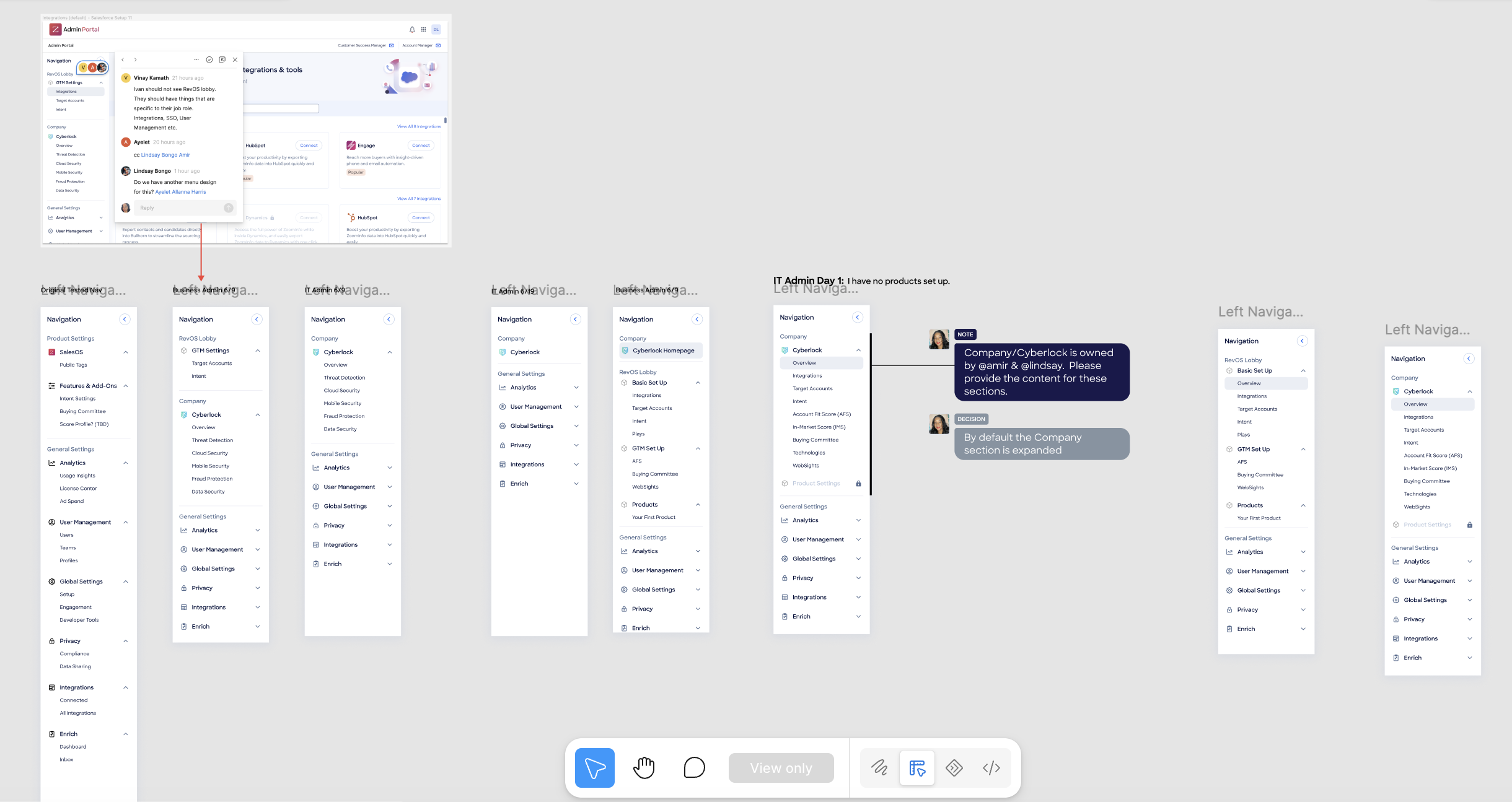
PMs across three orgs were competing for top-level navigation space with no shared framework for what belonged where. There was no ownership of global versus product-specific settings. And this wasn't a design preference — it was a real risk to Copilot adoption and time to value for new users.
Leadership hadn't scoped a navigation redesign into the roadmap. There was no budget for it, no timeline for it, and initial resistance to adding scope to an already complex launch.
So I reframed it. Not as a design fix, but as a business adoption risk. If users couldn't find Copilot's AI features after setup, the investment in building them would not deliver the returns the business expected.
With my manager's support, I decided to prototype and test without waiting for formal approval — building the evidence that would either prove the problem real or put it to rest.
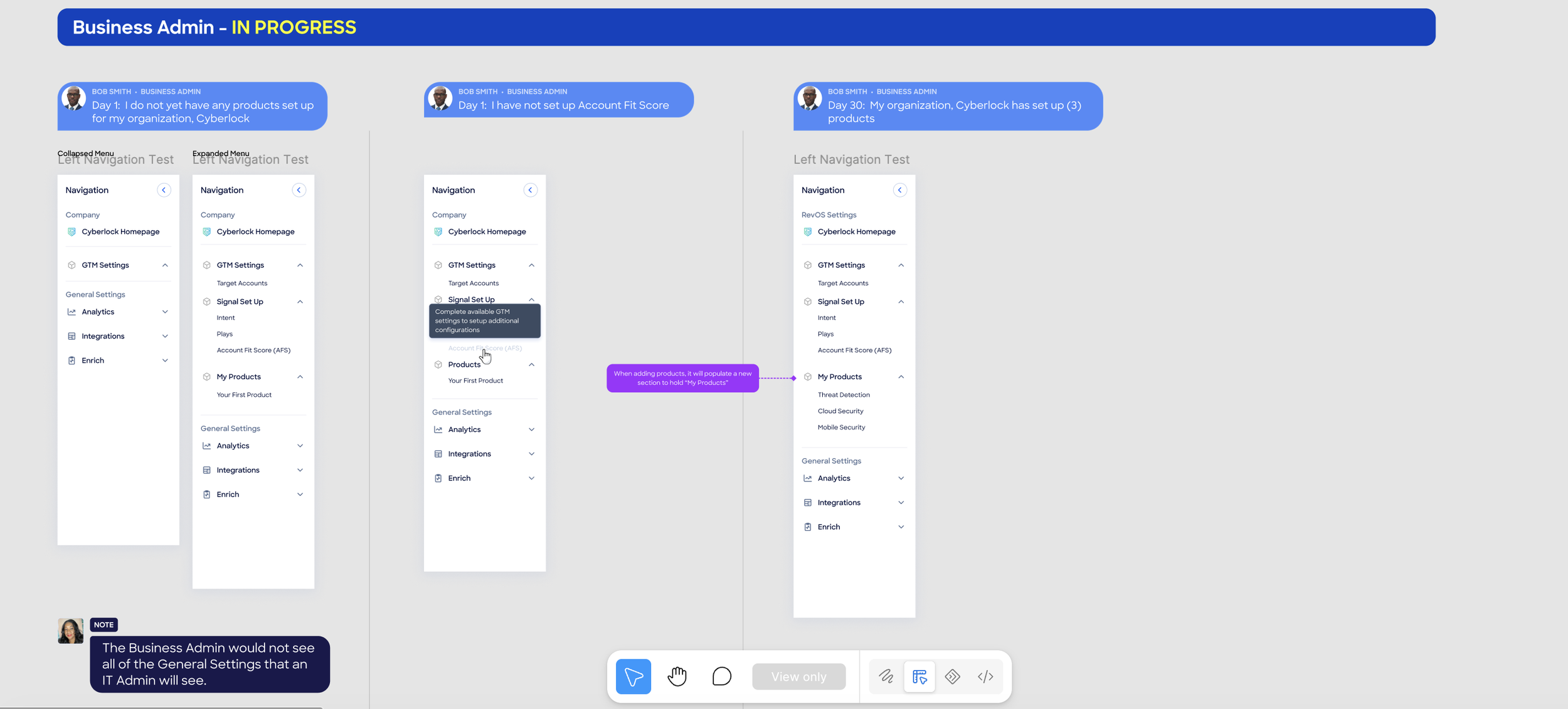
Hands-on craft. I led initial concept development and mentored a designer through rapid research cycles. We ran A/B tests with real customers across all three product orgs, measuring findability, naming clarity, and task completion.
Systems thinking. I built a Navigation Strategy Framework so PMs could self-assess where new features belong and get the right sign-off. I worked with the Design Systems team to codify new nav components in parallel with testing — the right way to accelerate production without sacrificing quality.
Cross-functional execution. I centralized all feature workflows in a shared Figma repository where every designer mapped their flow alongside PM contact information, creating instant visibility across the entire experience. Weekly critiques with incremental leadership updates built buy-in over time rather than asking for it all at once.
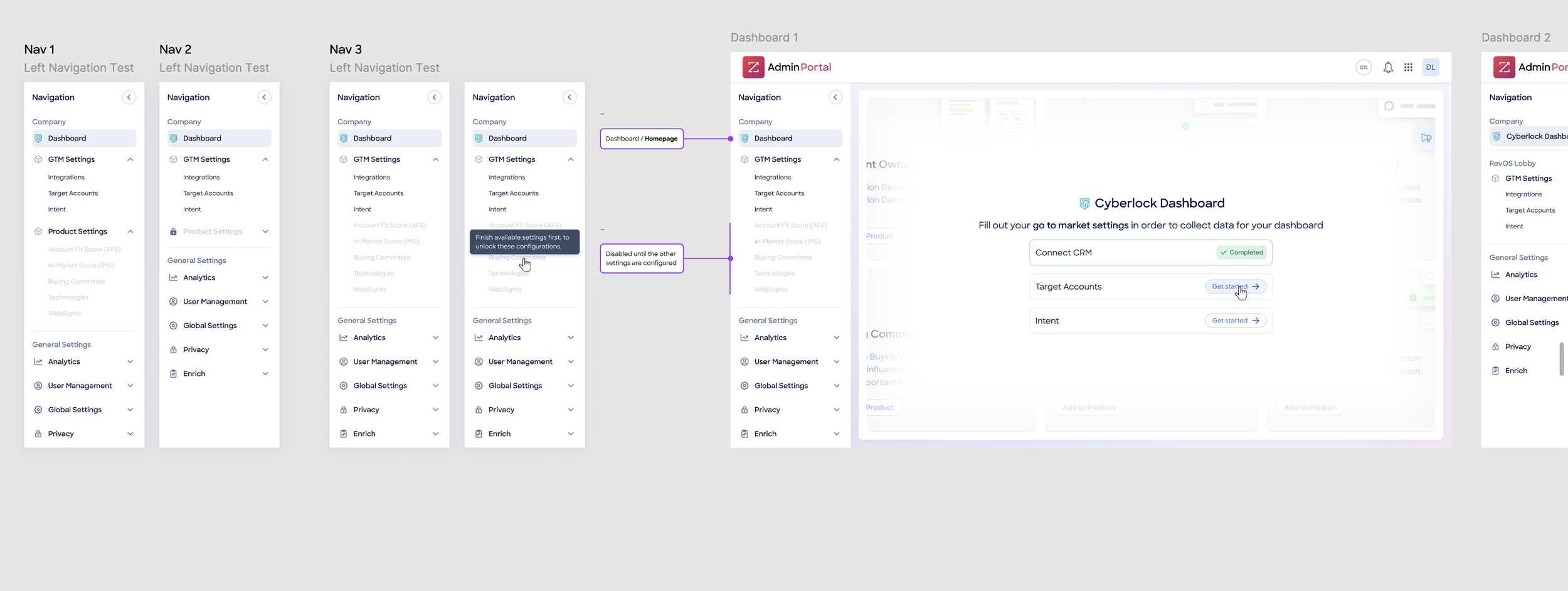
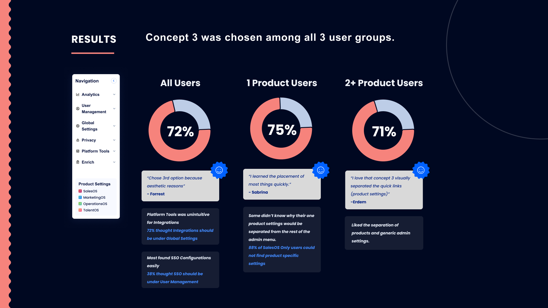
Copilot launched on time with a unified navigation structure across all three product orgs — the first time SalesOS, MarketingOS, and Admin Portal had shared a coherent information architecture. New users could find and complete Copilot setup without friction, reducing time to value from day one.
The Navigation Strategy Framework outlasted the project. It became the long-term playbook for how ZoomInfo's product teams coordinate on shared navigation, well beyond Copilot.

Recruiter Platform (TalentOS) — ZoomInfo
The data was already there. The product wasn't.
Manager of UX/UI · ZoomInfo · Year one, concept to launch
ZoomInfo had spent years building the most comprehensive B2B contact database in the industry. Sales teams used it to find buyers. But a different kind of hunter had been quietly working around them: recruiters, trying to source passive candidates using a product that was never designed for them.
In July 2020, ZoomInfo hired me as the first UX resource dedicated to a new use case: a recruiter platform built on top of the same data infrastructure the sales team relied on. There was no product. No team. No design patterns tailored to this persona. Just a clear business opportunity and a mandate to build.
I had to do three things at once: understand recruiters deeply enough to design for them, hire a team to execute, and establish design standards that would hold as the product scaled.
Marcus is a corporate recruiter at a mid-size technology company. He is trying to find Director-level engineers at companies with over 50,000 employees that use specific technology stacks. His current tools show him who is actively job hunting. What he actually needs is signal: who is passively reachable, what environment they are coming from, and whether the timing is right for an outreach.
The existing ZoomInfo UI was designed around sales prospecting logic. A sales rep qualifies accounts first, then finds contacts within them. A recruiter builds a candidate profile first, then uses company context to filter for fit. The filtering logic, the way results were saved, the way outreach was sequenced: all of it had to be rebuilt for a fundamentally different mental model. Reusing the sales product was not an option. Starting from scratch was the only honest path.
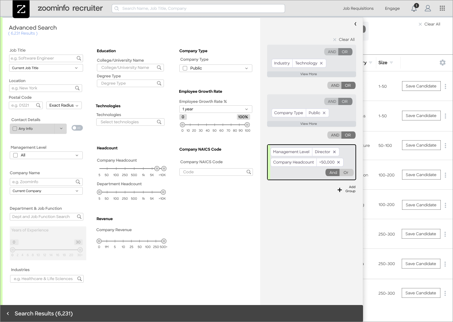
I started with research. Shadowing sessions with in-house recruiters and agency sourcers to understand how they structured a search, where they lost confidence in results, and what signals they trusted. The advanced search became the centerpiece of the product because that is where recruiter logic lives: layered, precise filters across management level, company headcount, department size, technologies in use, company growth rate, and more. Recruiters needed to build and save complex filter combinations, not run one-off queries and start over.
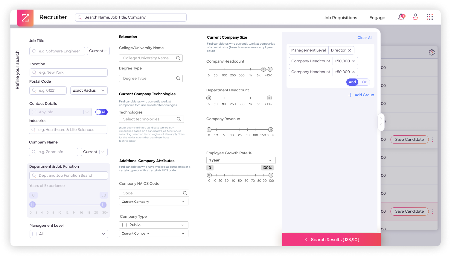
I recruited a team of UX and UI designers to build alongside me and established a cross-product Design Language Strategy so our new components could coexist with and eventually inform the broader ZoomInfo design system. Every pattern we introduced had to feel native to the ZoomInfo product family while solving problems that family had never been designed to address.
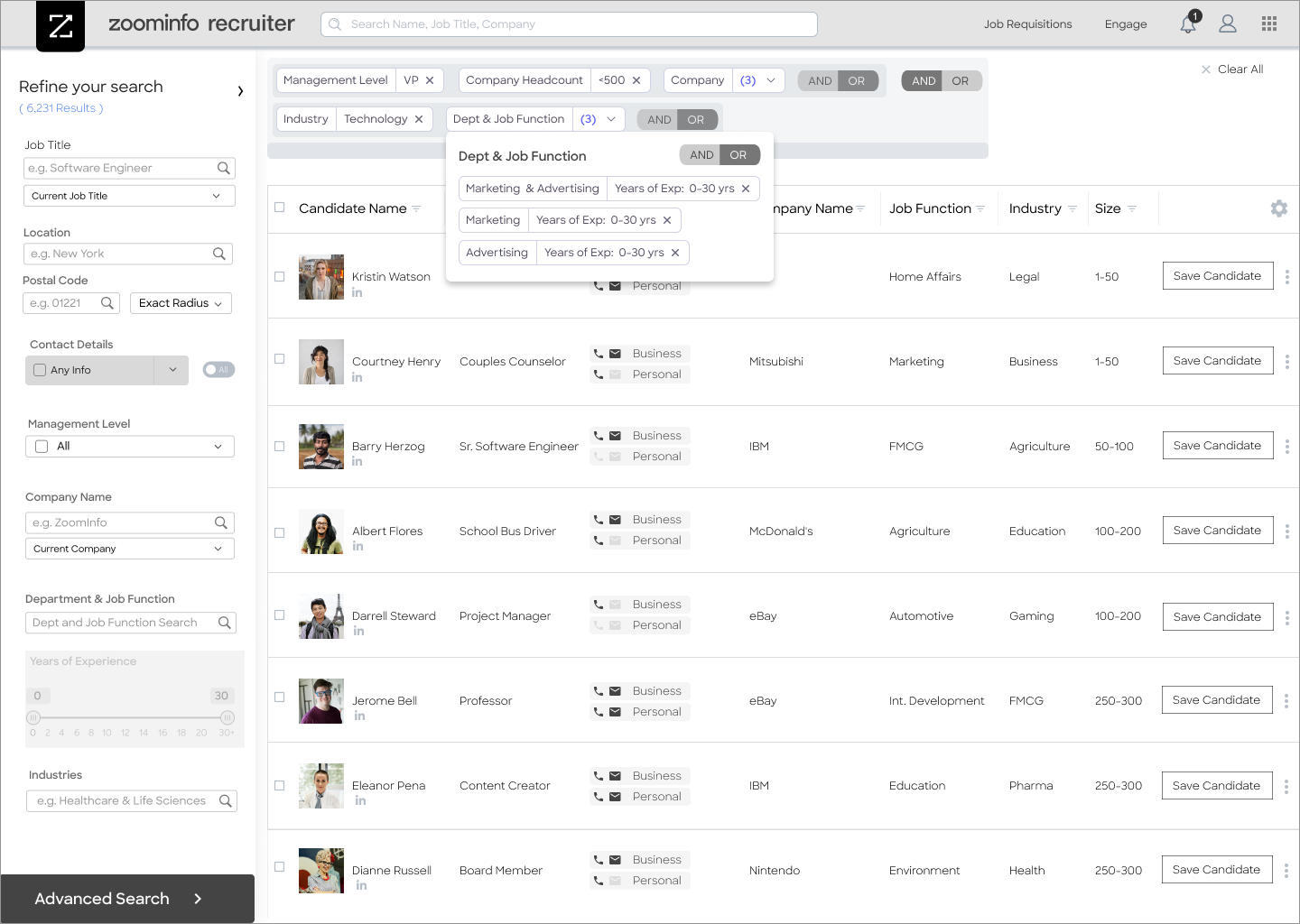
The Recruiter Platform launched within year one as a multi-million-dollar product line, opening a net new buyer segment and contributing significant new revenue to ZoomInfo. It has since grown into TalentOS, a standalone product offering with its own go-to-market motion.
The Design Language Strategy built during this engagement did not stay with the project. It became a foundation for cross-product consistency across ZoomInfo's expanding suite, one of the early building blocks of what eventually became the company-wide design system.
The platform was never a filtered version of the sales product. It was a different way of thinking about the same data, designed specifically for the people who had been trying to use it all along.
Airline Baggage Kiosk — Southwest Airlines
Designing a Kiosk That Works from Tampa's Heat to Chicago's Snow
Lead Designer & UX Researcher · Southwest Airlines · 6 months, research to delivery
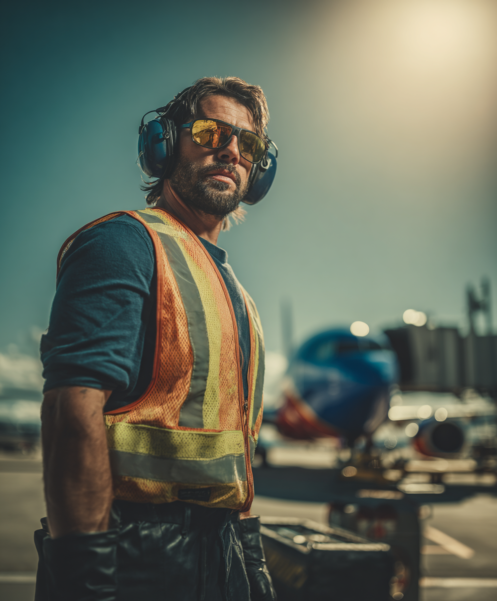
Southwest Airlines employs roughly 4,000 baggage handlers across 50+ airports nationwide. They share the same mission: move fast, stay accurate, keep flights on time. The kiosks they relied on were not designed for the conditions they actually worked in.
I traveled weekly from Boston to Dallas, shadowing handlers on the ground at multiple airports. Tampa tarmacs hit 120°F in summer. Chicago workers operate in -5°F windchill in January. The same interface had to hold up for both, and it was not.
The finding that drove everything came directly from the field. Workers could not interact with the screen without removing their gloves. In freezing temperatures that is not a minor inconvenience. It is a real operational bottleneck with a direct impact on turnaround time — and it had never been documented as a design constraint.
I brought that finding back to the team and reframed the problem: this was not a usability preference. It was a physical access failure with measurable downstream consequences. That reframe changed what we designed for and gave the project a specific, testable objective instead of a general directive to improve the interface.
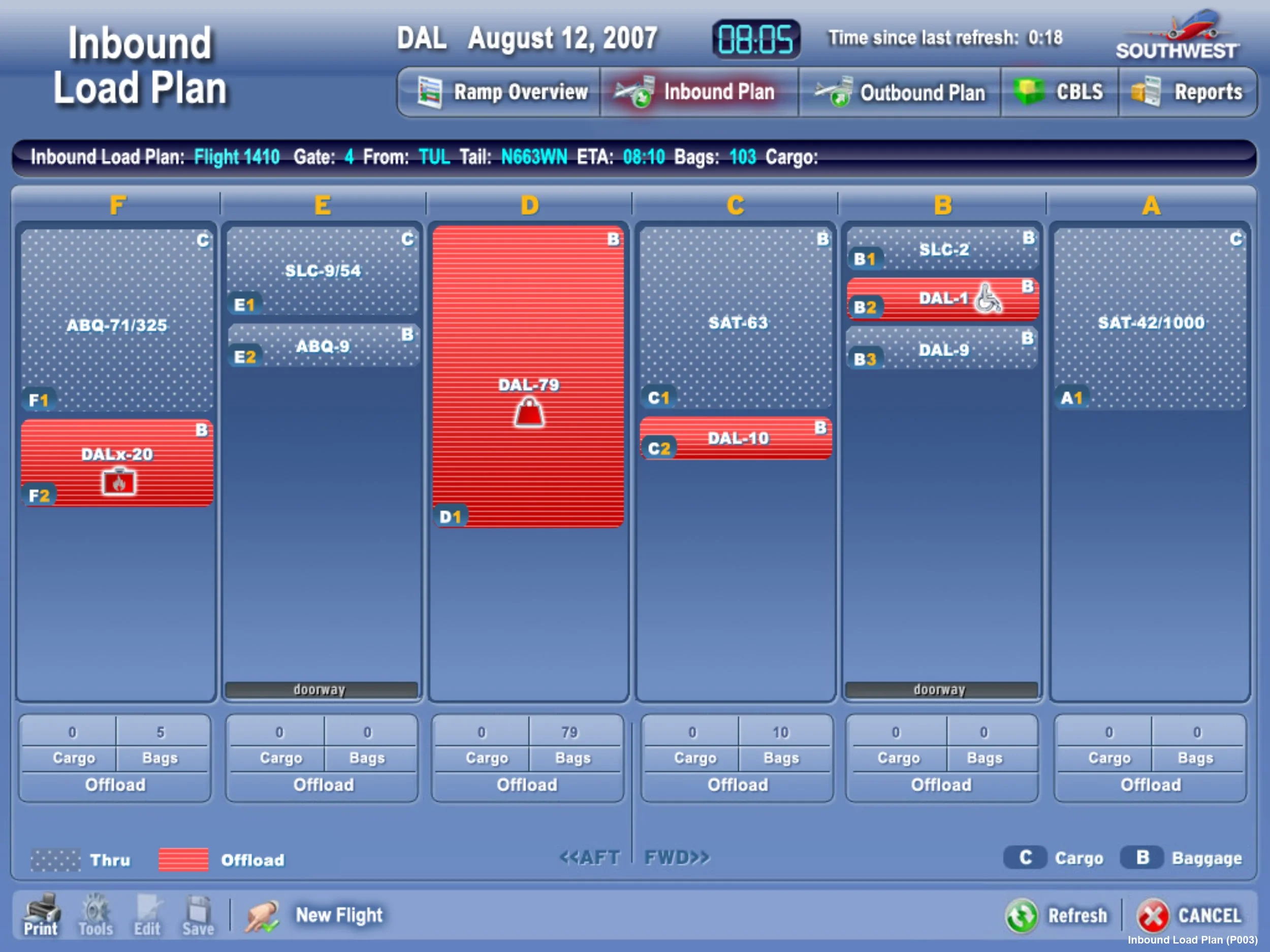
The solution was built around the physical reality of the job: glove-friendly large touch targets, high-contrast and low-light adaptive display modes to handle both blazing midday sun and pre-dawn darkness, and minimal navigation optimized for speed over completeness. I collaborated directly with hardware manufacturers to ensure the software and kiosk were designed as a unified system from the start, not two separate products bolted together after the fact.
Field validation ran across multiple airports with actual handlers in actual conditions. We tested with gloves on, in heat, in low light, and at the pace of real turnarounds until the interface held up in every environment it would ship into.
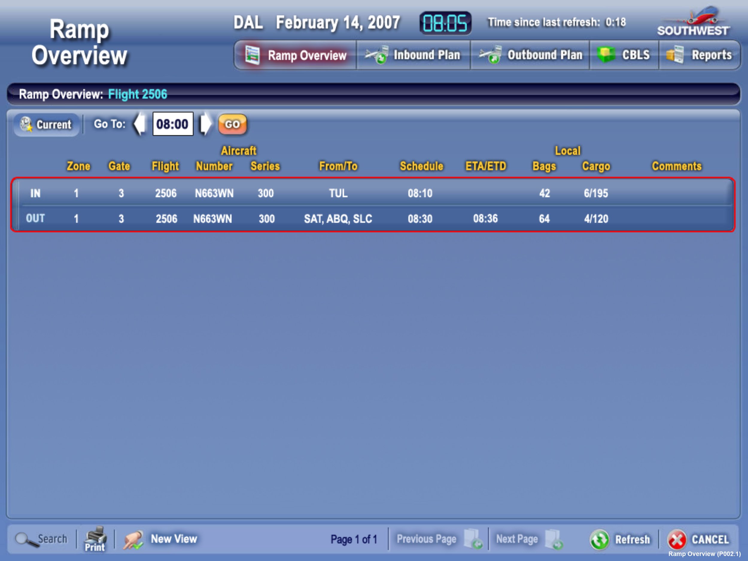
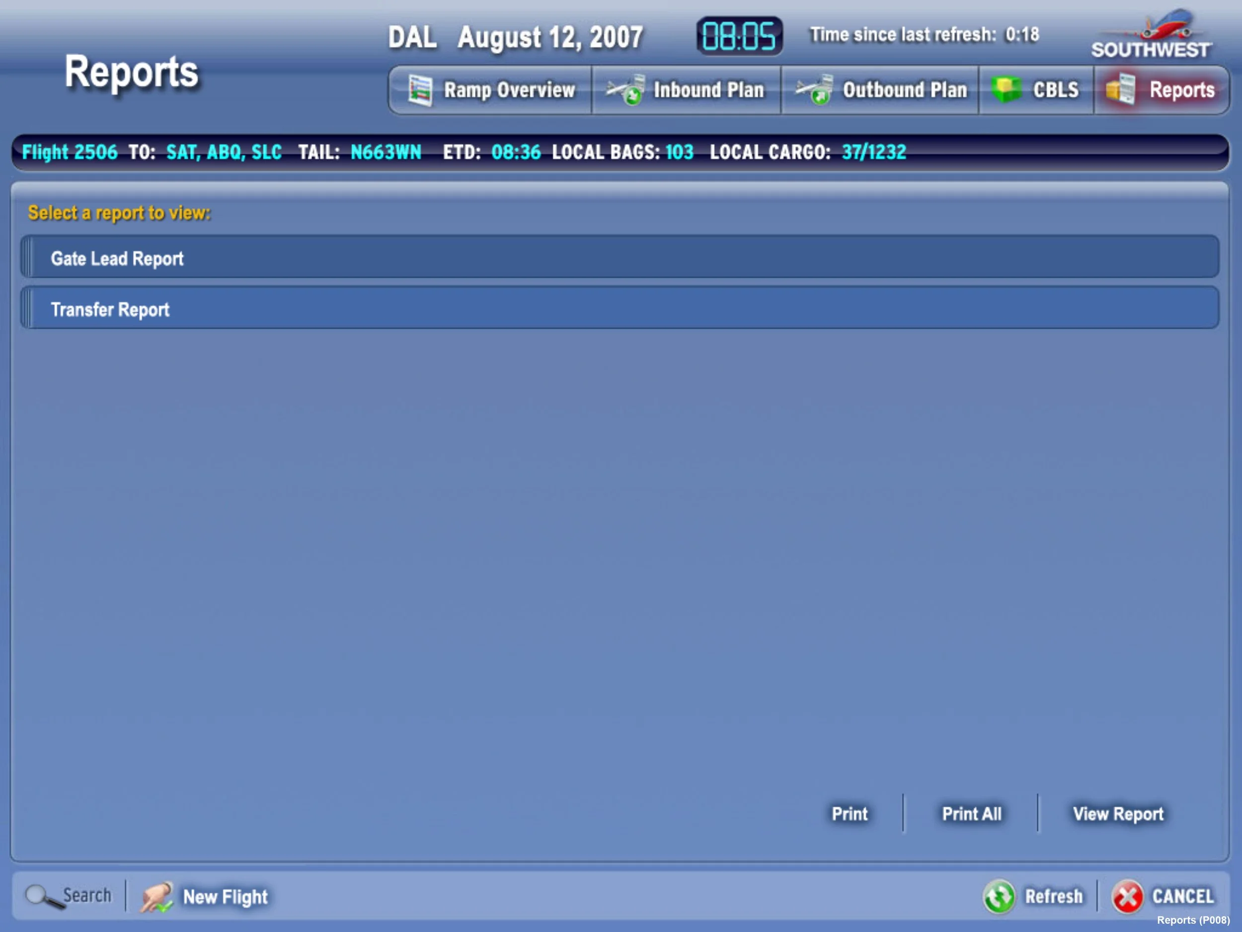
The redesigned kiosk deployed across 50+ airports nationwide, reaching 4,000+ frontline workers and reducing aircraft turnaround time by 25%. It was the first version of the product designed as a hardware-software system from day one. Field teams stopped losing time to a tool that was never built for the environment they worked in.

Robot Fleet Intelligence Dashboard — Vecna
Real-Time Intelligence for a Warehouse Full of Robots
Design Lead · Vecna Robotics / FedEx · 2 months, research to ship
Vecna builds autonomous robots that move freight inside FedEx logistics centers. The operations leads responsible for keeping throughput steady were working without real information: performance reports arrived monthly, formats varied by site, and event logs cleared after three days, making root cause analysis nearly impossible.
When a robot started degrading, the team typically wouldn't know why until a monthly report confirmed what they had already suspected. By then the disruption had already happened.
The project brief was for a reporting dashboard. The research surfaced something different: this wasn't a reporting problem. It was a visibility problem. Operations leads didn't need better summaries of what happened last month. They needed to know what was happening right now, at the individual robot level, so they could act before downtime became a disruption.
I reframed the product from a reporting tool to an operations tool. That shift changed everything: the information architecture, the update cadence, the level of drill-down, and the entire design priority of the dashboard. Historical summaries became secondary. Real-time status became the lead.
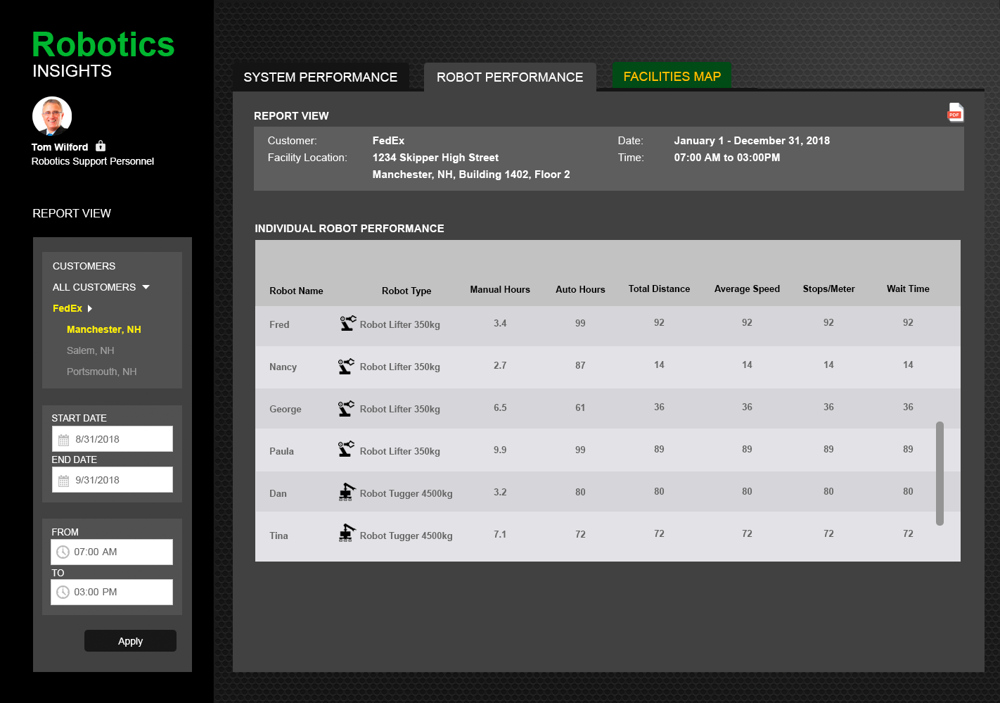
I led research and design over two months from kickoff to ship. I interviewed operations staff across FedEx sites to map the questions they were actually trying to answer in real time, then used those questions to define the information architecture from the inside out. Every design decision was tested against a single question: can someone act on this in the next five minutes?
The final product included a real-time fleet map showing every robot's status, location, and current task; expandable performance views with drill-down into errors, throughput, and uptime; and a white-labeled UI that could ship to FedEx and other logistics customers without modification.
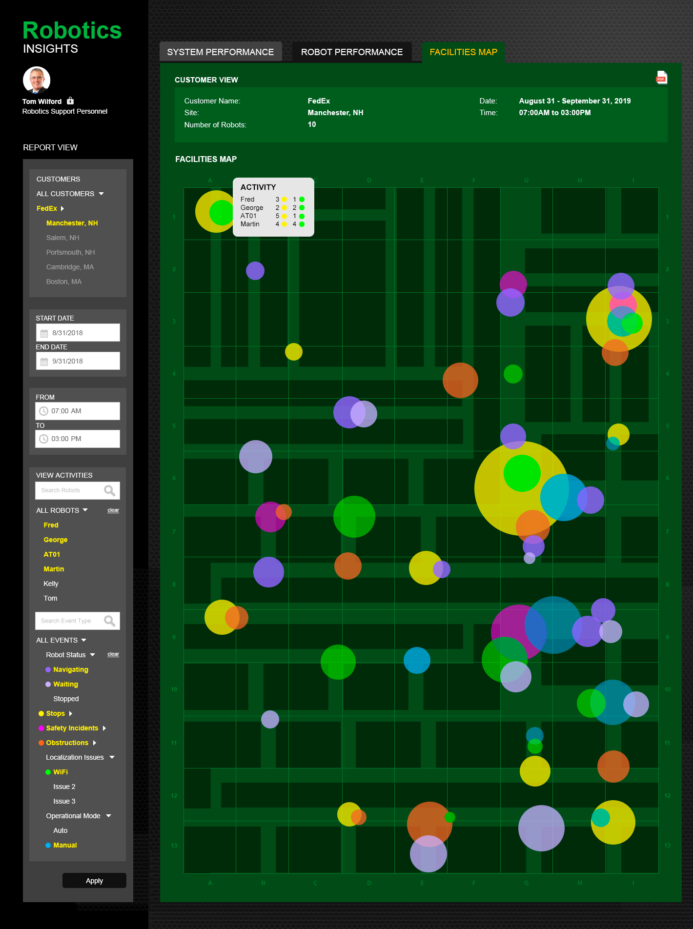
Operations went from a 30-day reporting lag to same-day issue resolution. The team could see what was happening in the warehouse in real time and act on it, instead of reading about it a month later. End-to-end design ownership across two months: research, information architecture, interaction design, visual design, and engineering handoff.

Case Worker App — Rhode Island Child Welfare
The Hours We Gave Back to Child Welfare Workers
Director of UX · Rhode Island Child Services · 3 months, research to pilot
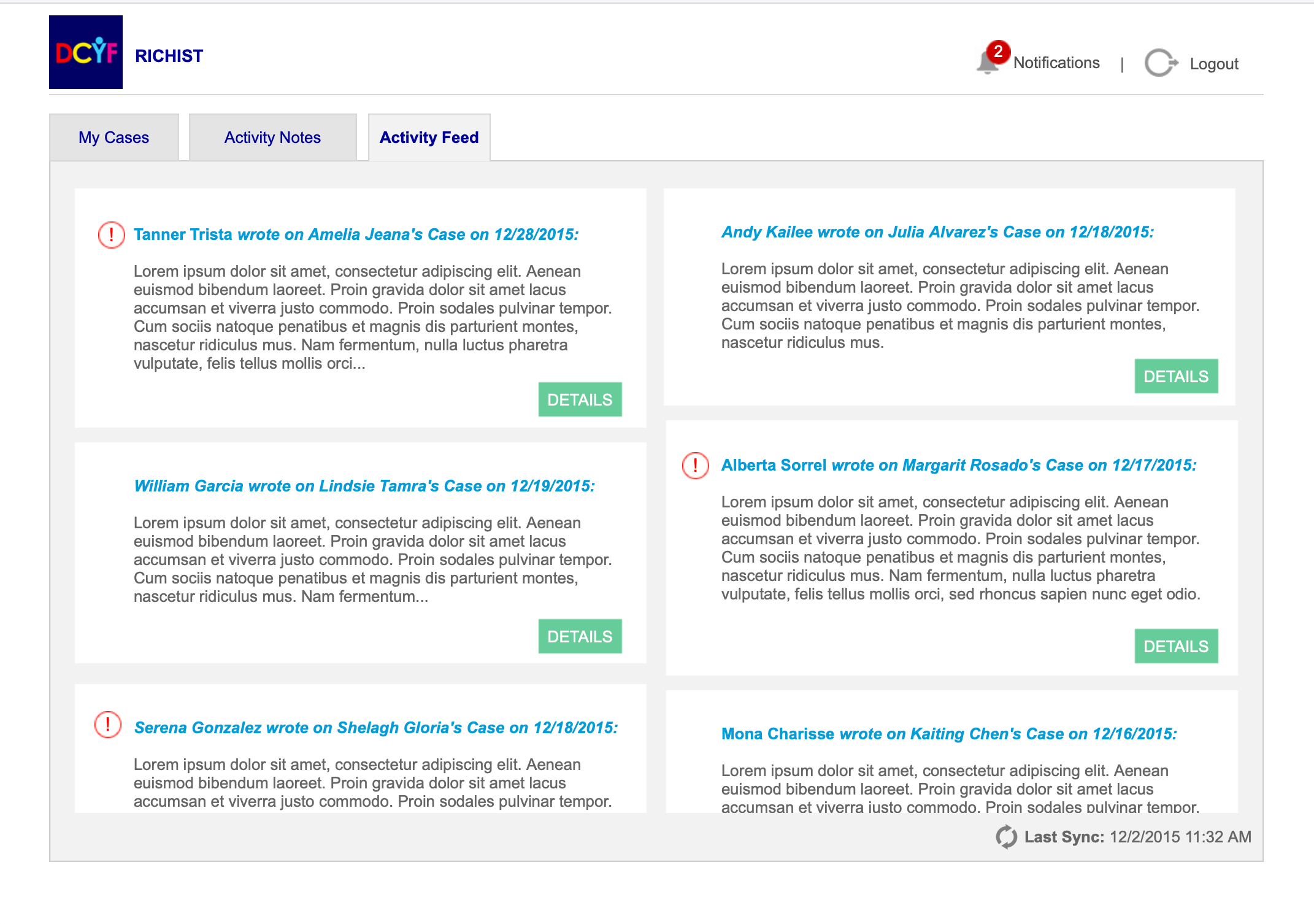
Rhode Island's Department of Children, Youth and Families needed a way for case workers to enter case notes in the field. The existing system, RICHIST, was desktop-only, locked behind intranet access, and so poorly documented that even the requirements for a redesign had to be built from scratch. DCYF engaged NTT DATA to lead discovery. I led the UX research and design: stakeholder workshops, user interviews, persona development, process flow mapping, and preliminary design concepts before a single production wireframe was drawn.
Terry has been a case worker at RICHIST for five years. She conducts family site visits, attends court hearings, and manages documentation for every child and every interaction. After each visit, she returns to the office and spends up to five hours re-entering notes she already took by hand in the field. Those are five hours she is not with her family, not preparing for the next hearing, and not resting before another day of visits.
The brief was for a web application to capture case notes. What the research surfaced was more specific: the documentation burden was not about the form itself. It was about the gap between where the work happened — in the field — and where it had to be recorded — at a desktop in an office.
Every hour of after-hours documentation was an hour taken from the families these workers were hired to serve. The design had to close that gap, not digitize the existing workflow. That shift — from better form to field-first documentation — changed the platform targets, the input modes, the sync requirements, and the entire supervisor review flow.
I led a four-week discovery engagement: stakeholder workshops with business sponsors to define vision and requirements, user sessions with case workers and subject matter experts to map task flows and surface pain points, and technical requirement gathering to understand the constraints of the existing RICHIST infrastructure.
From those sessions I developed the primary user persona, a complete case notes process flow across eight use cases from login to sending notes, and preliminary design concepts across mobile and desktop that demonstrated what field-first documentation could look like in practice. The prototype was built to test against real user scenarios before handoff.
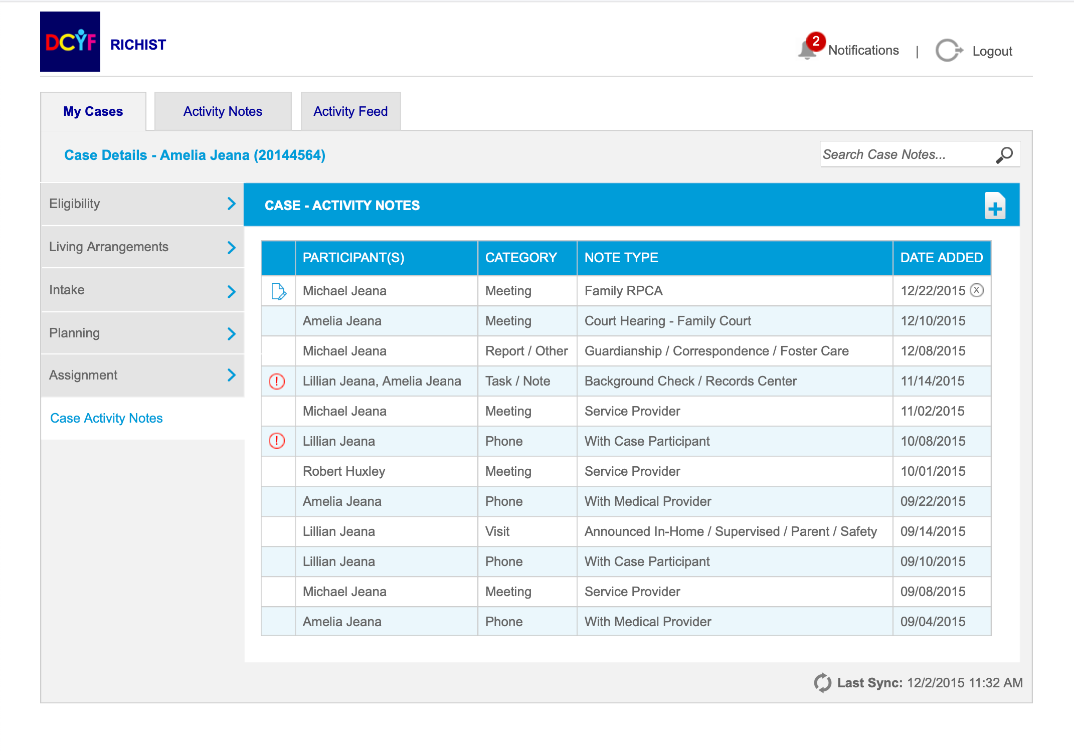
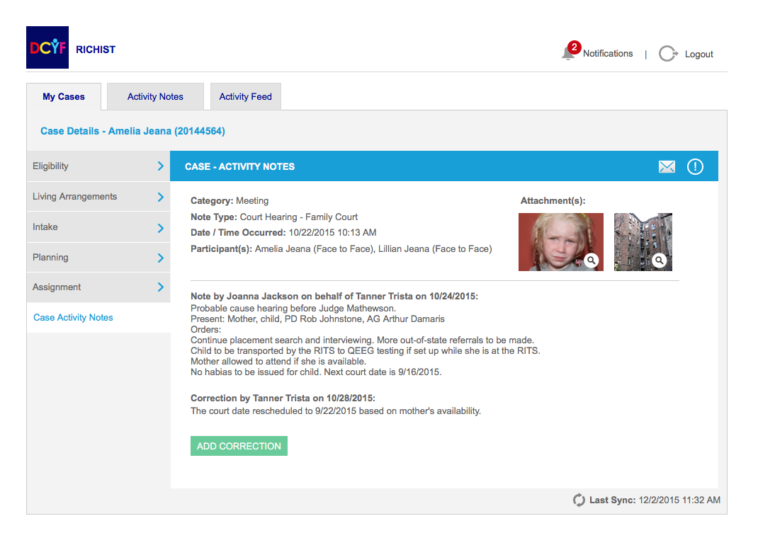
The pilot system gave case workers real-time mobile documentation: case notes captured in the field with photo, audio, and document attachments tied directly to individual records, synced immediately to the office system for supervisor review. Workers who previously spent up to five hours re-entering notes after each visit could now document during the visit itself.
The hours DCYF gave back to its case workers were hours returned to the children and families they served.

Tai Chi Mobile App — COPD Patients
A Breathing App for the People Who Struggle Most to Breathe
Director of UX · Healthcare Client · 3 months, research to delivery
A healthcare research client was building a Tai Chi monitoring application for patients managing chronic conditions. The goal was clear: use guided Tai Chi practice to improve patient outcomes outside of clinical settings. What wasn't clear yet was who the product was really for, and what those people actually needed.
I led user research and UX strategy for the engagement, conducting stakeholder interviews and synthesizing findings into personas, a needs matrix, user scenarios, and a proposed application screenflow. The research shaped every design decision that followed.
Francine Wilson is 67 years old, recently diagnosed with severe COPD. She also lives with diabetes and severe arthritis. Walking short distances leaves her breathless. Stress around her breathing sometimes triggers panic attacks. She takes Tai Chi once a week and hopes it will help. Getting to class more than that is not realistic.
Everything she needs between classes, she currently goes without. There is no guided breathing support at home. No movement correction when she practices alone. No way for her instructor or physical therapist to know how she is doing between appointments. The app existed to fill that gap, and designing it meant understanding every person in her care circle, not just Francine.
Francine was the primary user, but she was not the only one. Her physical therapist Mark needed to monitor patient progress remotely and adjust dosage without waiting for a face-to-face visit. Her Tai Chi instructor John could not currently give students individual feedback outside of class. Her orthopedic surgeon Dr. Wilford had a more fundamental question: could the benefits of Tai Chi even be measured at all?
Four distinct stakeholders. Four different definitions of what a successful session looked like. All of them needed to communicate with each other, and none of their current tools supported that. The app was not just a guided practice tool. It was a care coordination layer that happened to live on a phone.


I conducted in-depth interviews with Tai Chi students across varying health conditions and experience levels, including patients managing arthritis, fibromyalgia, balance disorders, and COPD. What emerged was consistent: students wanted feedback, but feedback that was gentle, not clinical. One student told me she wanted less focus on precision and more on general direction. Another said the meditative quality was the most important part and anything that disrupted that flow would be counterproductive.
Those signals directly shaped the design. Movement guidance needed to be ambient, not interruptive. Correction prompts needed to feel like encouragement, not failure states. Breathing assistance had to be available as a first-class feature, not a hidden setting. And the instructor and therapist dashboards needed to surface patient progress without requiring the patient to do extra work to share it.
From the research I developed four full user personas, a user needs matrix across all stakeholder groups, eleven user scenarios spanning vitals monitoring, movement correction, breathing assistance, stakeholder communication, and practice reminders, and a proposed application screenflow that organized all of it into a coherent product structure.
The research deliverables gave the product team a clear, validated foundation: who the users were, what they each needed, how those needs intersected, and in what order the application needed to address them. The screenflow became the blueprint for a mobile experience that could serve Francine at home, keep her instructor and therapist informed, and give her physician the measurement framework they had been missing.
The hardest design problem was not the breathing exercises or the movement monitoring. It was building a single application that could hold four entirely different users together without any one of them feeling like an afterthought. The research made sure none of them were.